Why Your Lithophane Looks Washed Out (It Is the Software, Not Your Printer)
Almost every free lithophane generator maps brightness to thickness in a straight line. Light transmission is exponential, so that crushes the shadows and flattens the midtones. Here is the maths, a side-by-side, and the fix.
You picked a good photo. You printed at 0.1 mm layers, vertically, 100% infill, white PLA. You did everything the guides said. And the print came out muddy — dark, flat, with the shadows collapsed into one shapeless mass and none of the punch the original photo had.
The usual advice at this point is to increase contrast in Photoshop and print it again. That is treating a symptom. The actual cause is almost certainly in the software that generated your STL, and it is the same mistake in nearly all of them.
The mistake
A lithophane generator has one job: decide how thick the plastic should be at every pixel. The obvious approach — the one nearly every free tool takes — is to map it in a straight line. Brightest pixel gets the minimum thickness, darkest gets the maximum, everything else spreads evenly in between:
thickness = max − brightness × (max − min)That is intuitive and it is wrong, because it assumes light passes through plastic in a way that it does not.
Light does not work like that
Absorption through a material follows the Beer-Lambert law:
I = I₀ · e^(−μt)
Light coming out equals light going in, multiplied by e to the power of minus the absorption coefficient times the thickness. The important word is exponential. Attenuation compounds with every extra millimetre rather than adding up.
For white PLA, μ is roughly 1.3 per mm. Run the numbers on a standard 0.8–3.0 mm lithophane:
| Thickness | Light through | Share of the range |
|---|---|---|
| 0.8 mm | 35.3% | 100% (brightest) |
| 1.0 mm | 27.3% | 76% |
| 1.5 mm | 14.2% | 37% |
| 2.0 mm | 7.4% | 16% |
| 2.5 mm | 3.9% | 6% |
| 3.0 mm | 2.0% | 0% (darkest) |
Look at the last column. Going from 0.8 mm to 1.5 mm — less than a third of the thickness range — already consumes 63% of the entire brightness range. The remaining 1.5 mm of plastic, more than half your material and more than half your print time, delivers the final 37%.
So a linear thickness map does not produce a linear brightness ramp. It produces a curve that plunges early and then flattens out. The midtones bunch up, the shadows crush into a single black, and the highlights never get as bright as they should. That is precisely the “washed out and muddy” result.
What it looks like
Both of the right-hand panels below are the same test target, at identical settings — white PLA, 0.8–3.0 mm, 0.12 mm layers — simulated as they would appear backlit. The only difference is how brightness was mapped onto thickness.
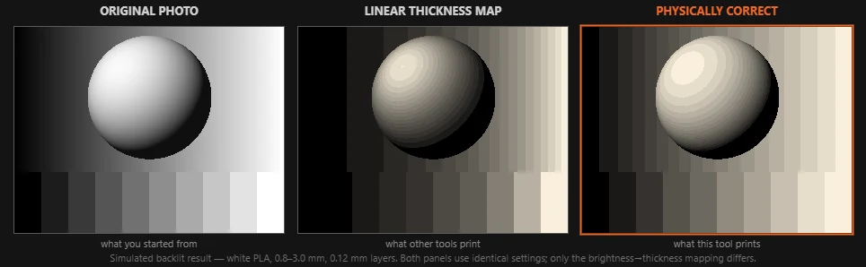
The middle panel is the linear map. The step wedge along the bottom loses separation at the bright end — the last few steps merge into each other — and the sphere’s highlight has gone dull grey. The right panel keeps the steps distinct all the way across and the highlight stays bright.
Counted across the whole frame, the linear map pushes 35.8% of the image into the darkest eighth of the available brightness range and leaves only 7.2% in the brightest eighth. The corrected map gives 19.0% and 18.7% — a roughly even spread, which is what your eye expects from a photograph.
That is not a subtle difference. That is the difference between a print you hang up and a print you throw away.
The fix
Work backwards. Instead of asking “how thick should this pixel be”, ask “how much light should come through this pixel” — and then solve for the thickness that delivers it.
Rearranged, Beer-Lambert gives you the thickness directly:
t = −ln(T) / μ
So pick the transmission T linearly across your brightness range, then take the logarithm to get the thickness. Transmitted light is then linear in image brightness, which is what you actually see when you hold the print up to a lamp.
In practice this means the software puts far more thickness resolution into the thin end, where transmission changes fastest, and less into the thick end, where it barely changes at all. The material is spent where the eye can use it.
Our lithophane maker does this by default, and has a toggle to switch back to the naive linear map so you can see the difference on your own photo rather than on our test target. It also simulates the backlit result before you print, using the same physics.
We are not the only tool that previews the lit result — 3DPlotter states it simulates Beer-Lambert attenuation through white PLA, and the open-source lithofun has a “realistic rendering” option. What is still unusual is publishing the model: the absorption coefficient is on the page, the correction has an off switch, and the preview accounts for how you orient the print.
The other three reasons
Mapping is the big one, but if you have fixed that and it is still flat, work through these in order.
Your thickness range is too narrow. Contrast is exponential in the range, so small changes matter a lot. 0.8–2.0 mm gives about 5:1 contrast and looks washed out; 0.8–3.0 mm gives about 17:1 and looks right. Check this before touching anything else.
Your layer height is too coarse. Thickness is quantised to whole layers, so a 0.8–3.0 mm range at 0.2 mm layers has only twelve distinct shades in it. Faces and skies need more than twelve. Drop to 0.10–0.12 mm.
You are lighting it from the front. A lithophane on a shelf under a ceiling light is a blank white tile. It needs a light source directly behind it — a window, an LED panel, a phone torch — and the more even that light, the better it reads.
There is a fuller list of numbers in best lithophane settings.
Why do the other tools do it wrong?
Not out of carelessness, mostly out of history. The first lithophane scripts were small and treated the image as a heightmap — which for a relief plaque, viewed from the front under reflected light, is a completely reasonable model. Relief and lithophane look like the same problem right up until you notice that one is read by shadows and the other by transmitted light, and only one of them is exponential.
Then everyone copied everyone. The linear map became the convention, and because a lithophane is invisible until it is lit, almost nobody was in a position to notice that the convention was costing them half their tonal range.
The exception worth naming is Kromacut, which applies Beer-Lambert properly — to multi-filament colour stacks rather than single-material thickness. So the physics is not a secret. It is just rarely applied to the plain single-colour case.
Which is why we built the preview.
Related: Lithophane maker with backlit preview · Best lithophane settings · Image to STL converter